DAI: Anatomy of a Symbol

If you’re reading this, chances are you’re curious: it’s an inherent trait of the DAI˚ALOGUE community. Symbols are an enduring aspect of how we communicate as humans, largely thanks to our ability to interpret them in countless ways. They are equal parts mystery and versatility: not defined by the visual alone, but by a complex intersection of our individual backgrounds, cultures, languages and experiences.
You may be curious about what our DAI logo represents, and the design process behind it. The symbol used in our logo originated as a family emblem, designed in early 2020 by The DAI˚ALOGUE founder, Emma Dai. Here’s the full story…
Words
Emma Dai
The Story
Back in 2018, I bought my brother a university signet ring as a graduation present, a future heirloom; it was then that we realised we didn’t have any heirlooms of our own, passed down from our ancestors. As the first ones in our family to have grown up outside of China, and the only two without Mandarin as our mother tongue, we knew very little about our relatives or heritage.
We grew up physically and culturally detached from our Chinese roots, which in some ways I’ve come to regret, but that’s the benefit of hindsight: ultimately, this deviation was inevitable, given our childhood in white suburbia, our parents’ English fluency and my own resistance to assimilate with a land and language I didn’t feel comfortable in. Rather than lament this gap in my identity, I came to appreciate this unique aspect of my upbringing; so my brother and I decided to create an emblem for ourselves, for our unique lineage, and commission our own heirlooms for this new branch of our family tree.
The Anatomy
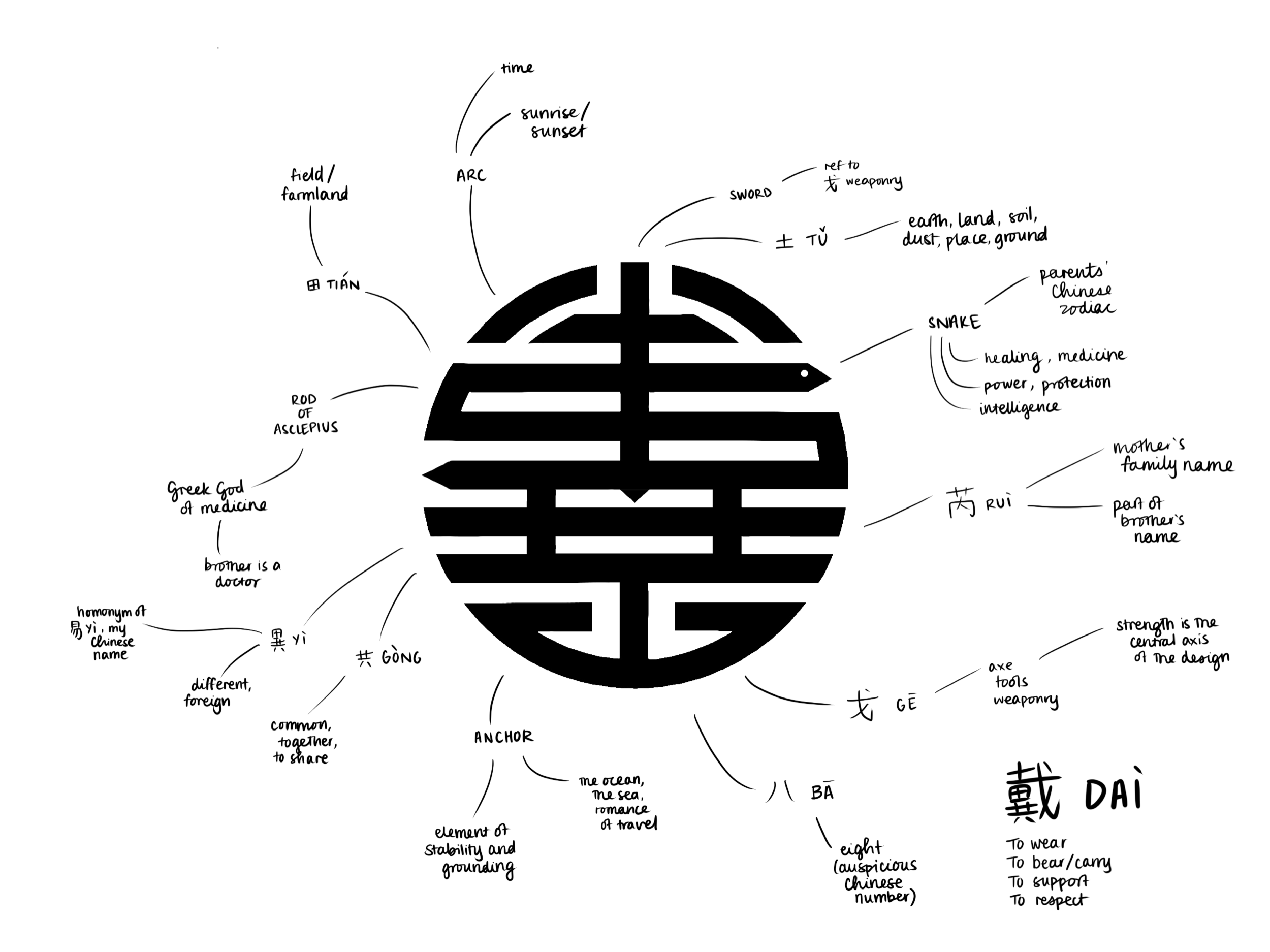
In conceiving the visual, I wanted to honour our Chinese heritage by referencing the aesthetics of old Chinese coins and fortune symbols—the circularity, the boldness of line, the manipulation of the character’s form in a way that created balance and harmony. These elements are common across much of East Asian symbolism, such as Japanese mon. European and American family crests are often complex and highly ornamented, which make them beautifully regal, but not particularly modern. My aim was to design something reminiscent of an ancient language, but execute it in a contemporary way.
In Chinese naming custom, the surname is always first and foremost. It speaks to the unparalleled importance of family, hierarchy, dynasties, ingrained over millennia. It was a no-brainer that 戴 Dài would be my character of focus, as it’s the character my brother and I have in common, but I also wanted to merge it with the character of my mother’s surname, 芮 Ruì: not only do these two in combination create my brother’s name, but the latter is a much less common Chinese surname, befitting for someone as independent as my mother (she’s also mainly referred to by surname, as her first name too complicated for most English-speakers).
The finer details came later as I was diving into my research for The DAI˚ALOGUE—also known as interrogating my father for the best part of an afternoon on the makeup of the 戴 character. It’s about as complicated as a simplified Chinese character gets, with each internal component (a ‘radical’) adding something to the story of the 戴 family. One of these radicals, 戈, has connotations of tools and weaponry; this is reflected in the sword aspect at the top of the emblem, and the axe shape at the bottom. Strength is the central axis of the design.
Finding further ways to link everything together, I decided to capitalise again on the tool element by styling the 田 radical into a winding snake, forming a simple graphic representation of the Rod of Asclepius. Asclepius is the Greek god of medicine—another nod to my brother, the doctor. Finally, the snake wraps it up nicely (pun intended): in the Chinese zodiac, our parents are both born in the Year of the Snake.
…and thus, the birth of a new family emblem. It was important to me that each member of my immediate family was adequately represented, while maintaining this overall unity through my design: through me. Every time I look at this symbol I’ve created, I extract new concepts and meanings from it. Yesterday I saw a gate, today I see an anchor, tomorrow I’ll see a horizon. It’s an Easter egg hunt that keeps on giving, and isn’t that the beauty of graphic design?
The Heirlooms
Watch this space—official photographs of the signet ring and pendant will be shared here once available.